Here’s a neat trick that will save you time and frustration when creating charts – save your charts as templates and re-use the settings again in the future.
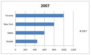
On the left is an example of a chart using Excel’s defaults. But this chart has too many problems: the bars are too far apart, they are all the same color (where do you want me to focus?), the x-axis has an unecessary maximum of 1,200 with frequent division by 200, there’s unnecessary title, legend and vertical lines.
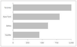
I want to adjust all this, so I manually correct this to the chart on the right. Note the gray bars are intentionally neutral. I will later highlight the important bars by adding color.
 Excel default Excel default |
 Manually updated Manually updated |
You could update the chart each time by manually changing the fill color, deleting the extra elements and so on. But in PowerPoint 2007 there’s a better way: save the second chart as a template so you can re-use it again and again. Here’s how.
To save it as a template
To apply that template to a new chart
|
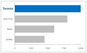
Now I have a neutral canvas on which to paint my picture. Maybe my message is look at sales in Toronto! I add some color and bold text and my message is clear – and in half the time.

